
Interfaces and user flows shaped around real tasks, clear information hierarchy, and responsive patterns that make digital products easier to understand and use.
United States Web Design System Pipeline Prototype
A Git-based workflow for proposing and reviewing improvements to the USWDS Figma kit
A contribution proposal to the People's Design System into how distributed teams can propose, review, and version improvements to the USWDS Figma kit using Git-based contribution patterns, with central governance left intact.

Why this exists
As needs evolve, agencies and contributors may create local fixes, custom variants, or entirely separate components without a clear pathway for sharing improvements back with the broader system. Becoming aware of this wihile volunteering for the People's Design System, I wanted to try and help and contribute with my skillsets, get out of my comfort zone, and increase familiarity with government design elements.
This investigation explores a lightweight contribution model that creates a shared space for:
- proposing component improvements
- validating reusable solutions
- documenting changes
- reviewing updates
- versioning design decisions
- publishing improvements for broader reuse
The goal is to make shared systems easier to improve while preserving centralized ownership and governance models. I created this workflow in response to an idea generated in the People's Design System while I was trying to contribute component updates: how can we best contribute with a bigger scope in mind? Instead of one-off contributions, we started to think about a more accessible and structured approach.
Initial workflow ideation
Early discussions and collaboration around this investigation have highlighted practical review constraints within my initial and relatively shallow Figma contribution models.
My initial idea was to contribute and pass source .fig files directly for internal review, reposting, or controlled publication processes but the conversation in the People's Design System forced me to think in with a larger view: how we more contribute in an organized way?
I immediately thought of how developers contribute to projects and Git. I discovered a repo, but being somewhat older, I thought it was be best for me to start by branching from the USWDS and emulate how I was actually thinking of the process.
I try and explore how a fresh Git-based contribution pattern could support:
- proposal documentation
- version history
- reusable change tracking
- contribution transparency
- distributed experimentation prior to adoption
The goal is to reduce friction around collaborative improvement while preserving centralized ownership and publication controls as well and to facilitate the surfacing of indepedent contractor capabilities through real, direct action.
Contribution model
The workflow mirrors more traditional software contribution models:
Issue → Branch → Test → Pull Request → Review → Merge → Release
Translated into design operations:
Problem Identified
↓
Local Figma Branch / File
↓
Component Improvement
↓
Validation
↓
Save Updated Local .fig File
↓
Git Commit
↓
Proposal Submission / Pull Request
↓
Review
↓
Merge
↓
Release / Publish
↓
Cross-Team Adoption
Contributors may not require direct access to a centralized Figma workspace during early exploration and proposal development.
They benefit from:
- a local workspace
- documented improvements
- reusable solutions
- a clear review path
- version control discipline
Source of Truth
This model separates responsibilities across platforms:
Figma = visual source of truth
GitHub = contribution governance + version history
Releases = approved versions for adoption
Design changes are created locally in Figma.
Before submitting changes:
- Save a local copy of the updated
.figfile - Replace/update the repository source file
- Commit changes
- Submit for review
This approach explores how design workflows may adopt contribution and governance patterns commonly used in software development.
AI-Assisted workflow notes
AI tools were used selectively throughout this investigation to support workflow validation, documentation refinement, and implementation review.
ChatGPT was used to help:
- validate Git branch and commit naming conventions
- refine the initial GitHub repository description
- spot-check component structure decisions during exploration and implementation
All workflow concepts, contribution models, component proposals, and investigation directions were developed and reviewed manually.
*It's good to source and describe AI use in this space.
Contribution requirements
Each proposed improvement should include:
- problem being solved
- current implementation
- proposed solution
- before/after screenshots
- Figma link or local file reference
- reusability rationale
- accessibility considerations (if applicable)
- implementation notes
Review criteria
Proposed updates should improve one or more of the following:
- flexibility
- accessibility
- scalability
- maintainability
- consistency
- reduced duplication
- documentation clarity
Example submission
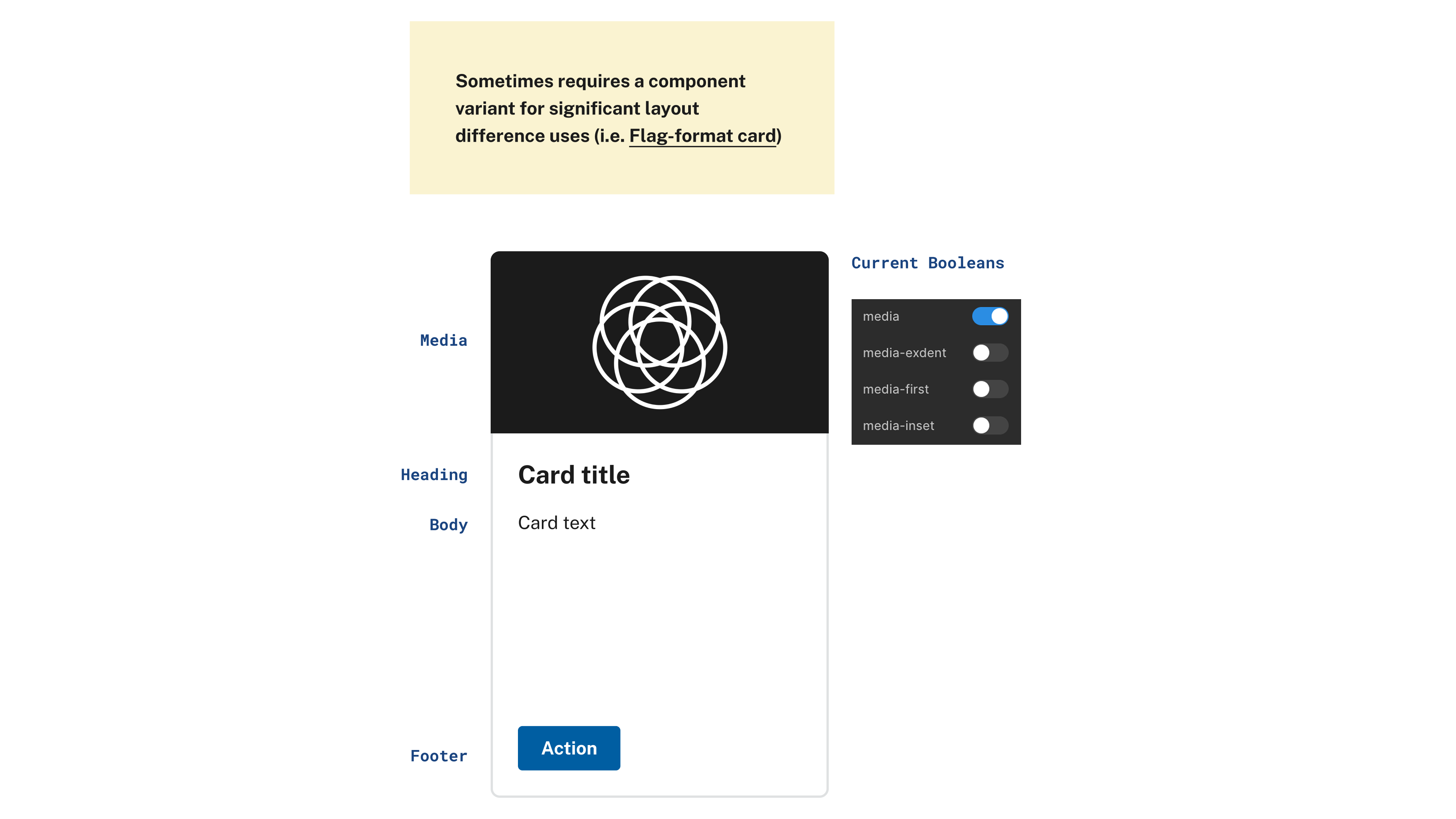
Example: Card Current Baseline
Current Card Component is very versatile.
Confirming and analyzing the baseline component.
Example: Proposed core pattern
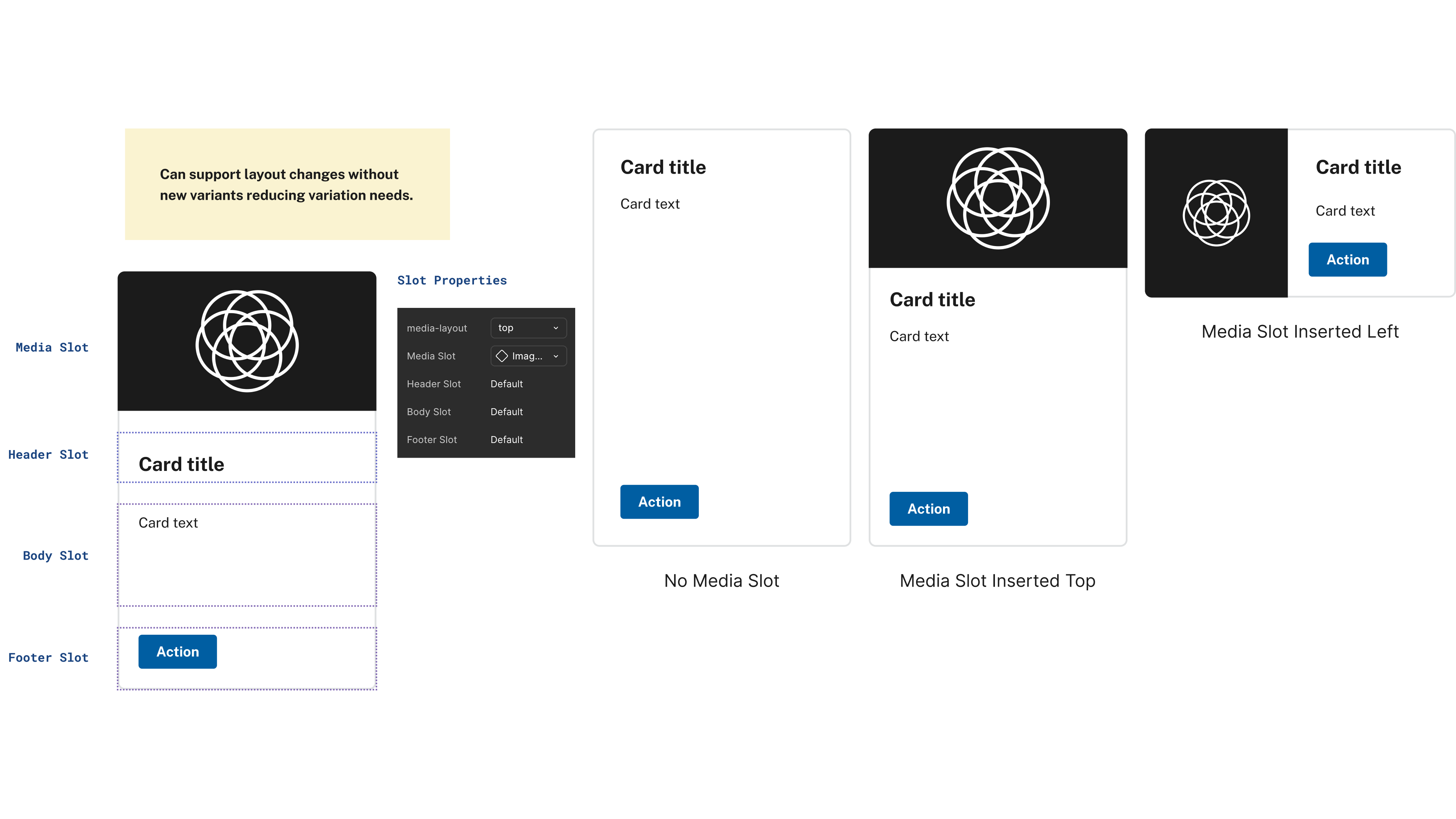
Figma’s new slots make a slot-based card possible. Media, header, body, and footer each become a slot, and a single media-layout property sets where the media sits.
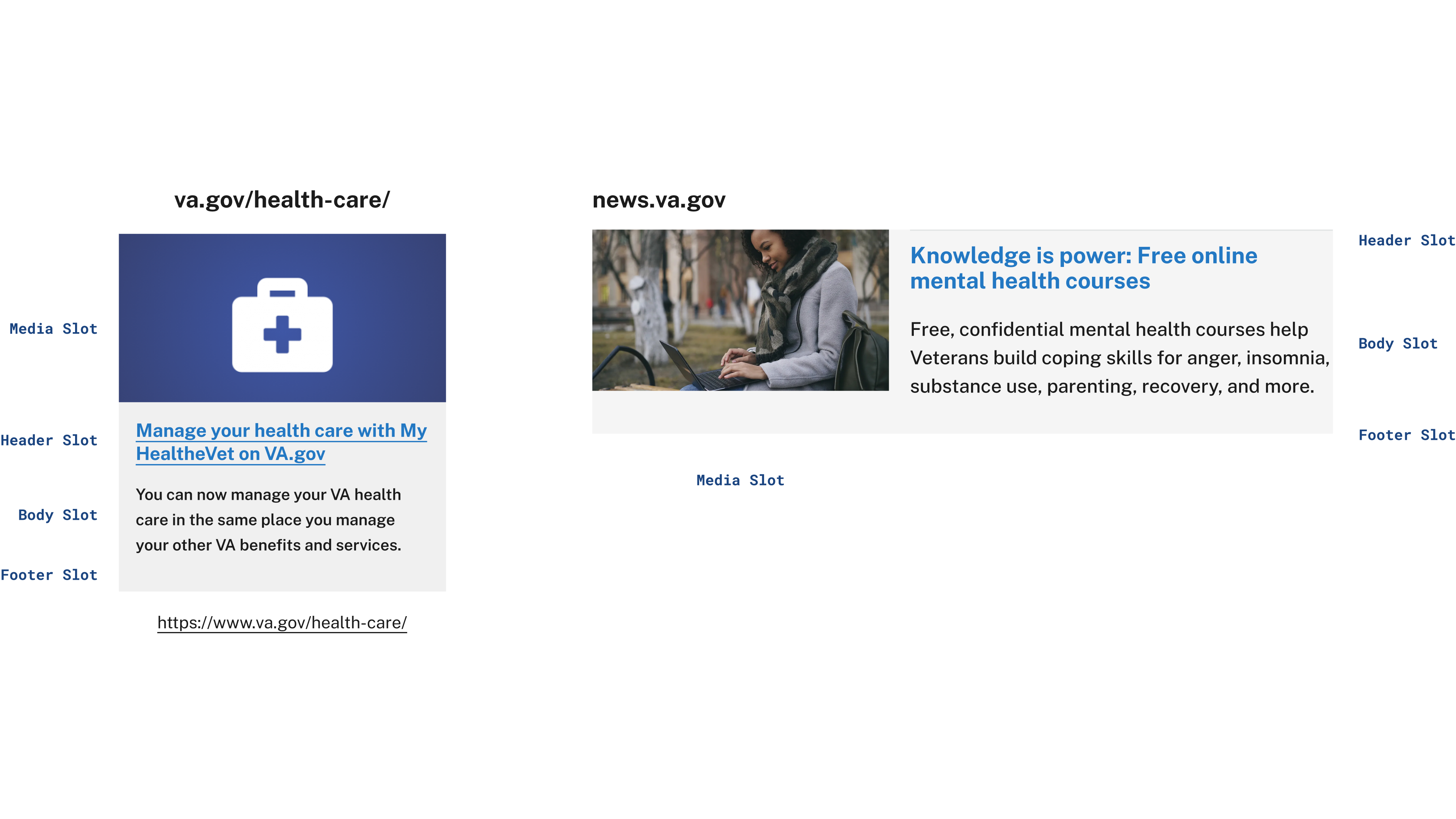
Usage Example
Example using the same component with the new Figma slots instead of variants.
Results
The investigation produced a documented contribution model, a proposal format, review criteria, and worked proposals for four USWDS components. Each proposal lives on its own branch, with the production component and the proposed version laid out side by side for review.
Card
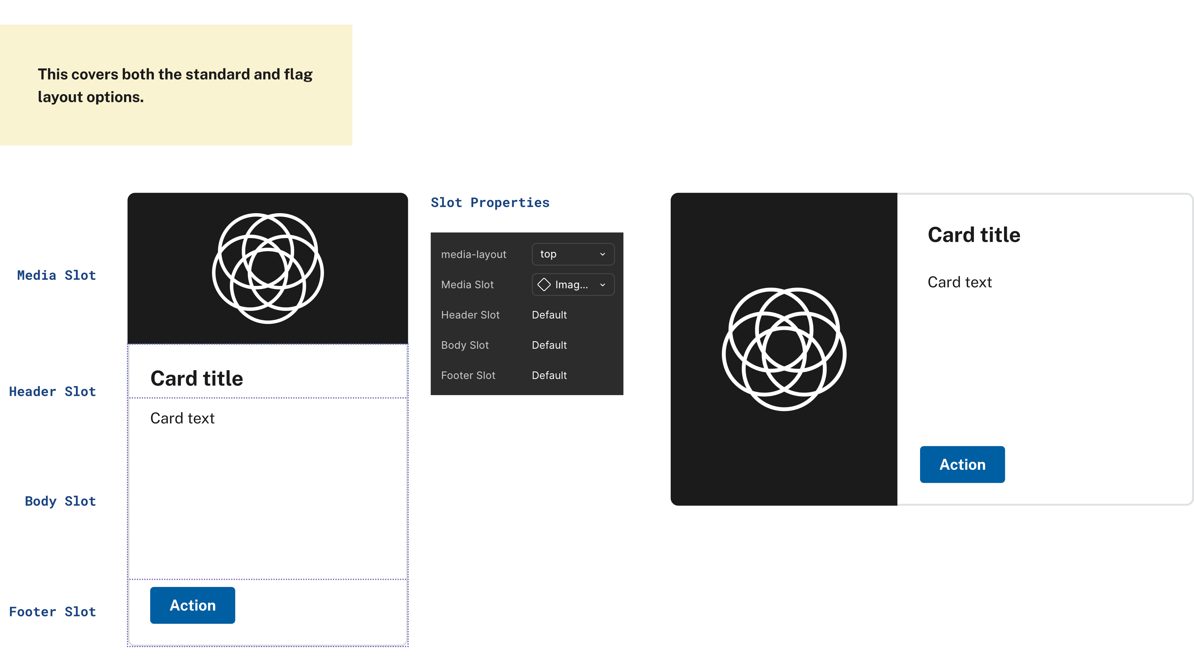
- Replaced the standard card and the separate flag-format card with one slot-based component.
- Four slots (media, header, body, and footer) and one media-layout property take the place of four media toggles: media, media-exdent, media-first, and media-inset.
- The same component covers cards with no media, media on top, and media on the left, layouts that previously needed their own component or variant.
Button
- Merged two component sets, USA Button and USA Button.big, into one, with size handled by a single property.
- Extended the big size from one color to all seven button types, taking big variants from 5 to 42.
- Every combination of type, state, and size now sits in one set of 84 variants (7 types × 6 states × 2 sizes), so designers switch a property instead of swapping components.
- Added hover micro-interactions for prototyping.
Banner
- Pulled the info cards and leading mark out into their own nested components, so they can change without touching the banner’s variants.
- The leading mark can be hidden or set to a government or flag mark, and the dot-gov icon can show the government or secure version.
- The banner itself keeps four variants: light or dark theme, expanded or collapsed.
Combo box
- Added a focus state, taking the input from four states to five.
- Added a dropdown item variant alongside the existing default and last-item options.
- Added hover interactions for prototyping. This proposal is still in progress.
Contributing to USWDS
The official U.S. Web Design System code, releases, and issue tracker live in the USWDS repository on GitHub.
Questions, ideas, and proposals for new components or patterns are discussed in USWDS GitHub Discussions, which is open to the public.
This project was facilitated by the People's Design System that has a significant Slack community; feel free to ask me for an invite.
Project scope
The services behind this work

UX/UI Design
Contact us
Let's make something.
Contact Aether Creative Studio to discuss web design, branding, and digital platform development. Use our form, schedule a call, or contact us directly:
- Email: info@aethercreative.studio
- Phone: (424) 248-8319
We're based in Los Angeles, working with businesses and organizations locally and remotely.