The Green Olive Catering

A refined digital system crafted for a modern Mediterranean food brand.
We reimagined The Green Olive Catering's digital presence with a clean, modern design system and a scalable CMS architecture, giving each location its own voice and independent functionality while staying brand-aligned.
TeaM: John Hansen
Last Update: October 2025
Visual Design / UX/UI Design / Webflow Development
The Green Olive Catering website homepage viewed on a laptop.
Fresh Foundation

Overview

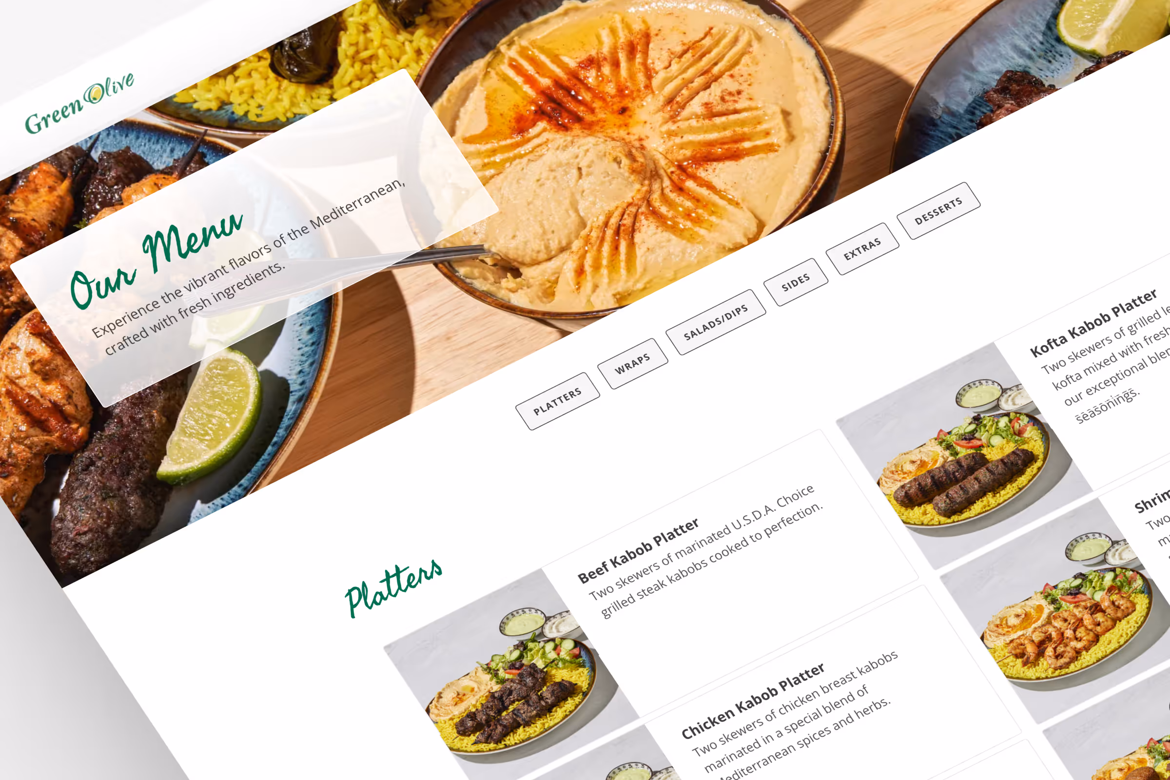
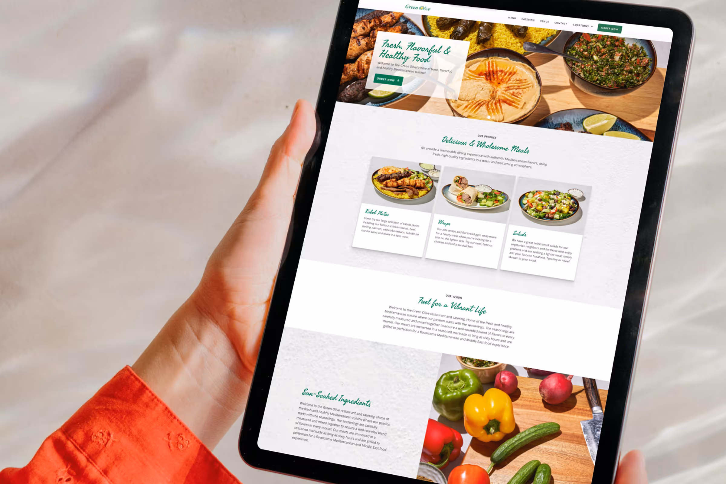
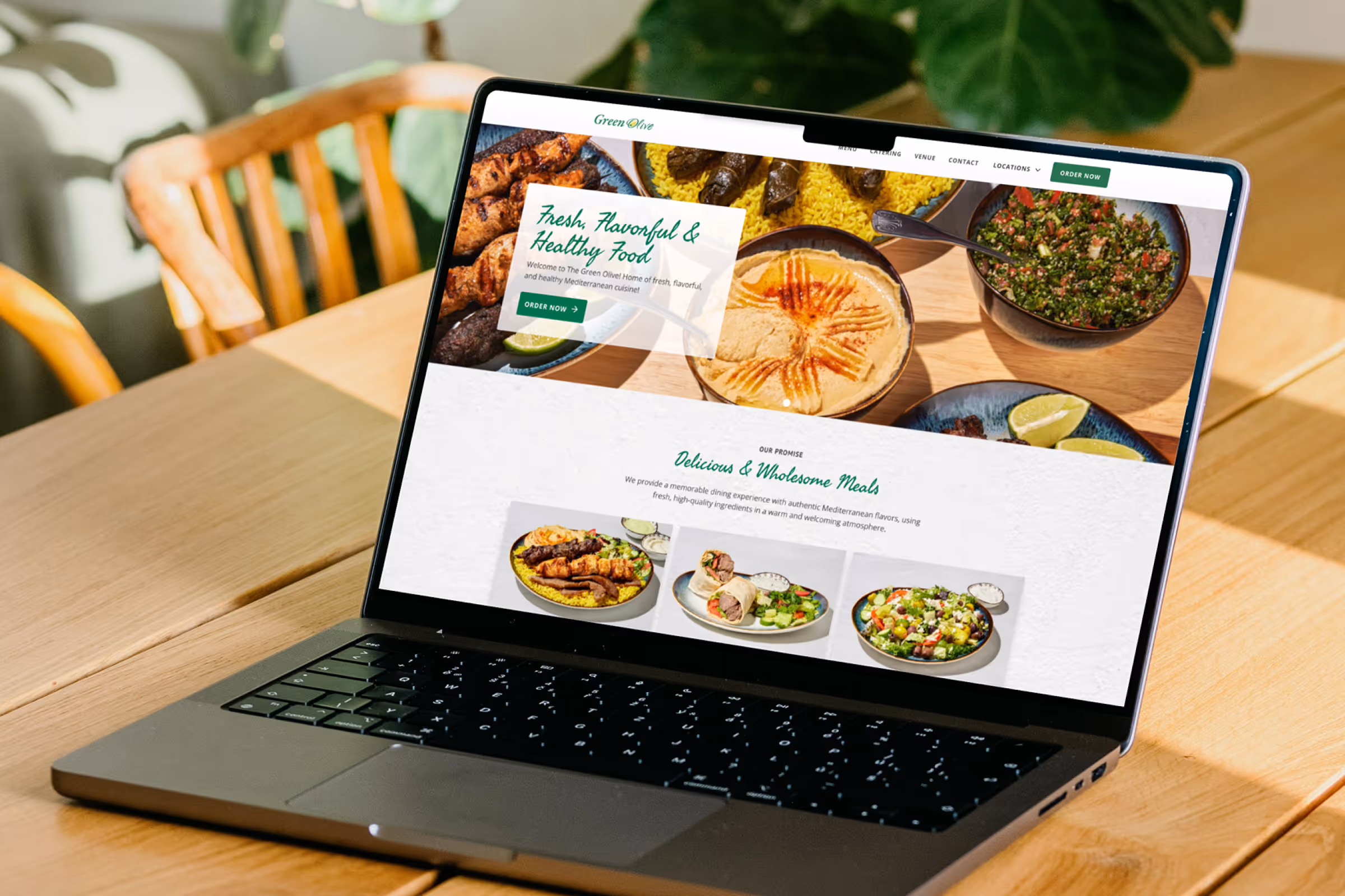
A scalable Webflow CMS build with independent control.

A set of The Green Olive restaurants needed more than just a redesign. With multiple locations offering different menus and prices, they required a flexible CMS collection for each location, one that preserved consistency while giving each locaiton the autonomy to serve its audience. The result: a refined design system built on a multi-CMS Webflow infrastructure, with clarity across every screen and dish.
The structure of the The Green Olive Catering project.
Split Identity

Challenge

One brand, three kitchens, no structure.

Each The Green Olive location in this cluster operated independently, but the digital experience didn’t reflect that. A single, outdated site tried to speak for all three — leading to confusion, content bottlenecks, and missed opportunities for showcasing local offerings.
The inconsistent websites that the previous locations had.
Early wireframes organizing the different location content.
Style & Structure

Approach

Brand-forward design with CMS-first thinking.

We began by refining the brand’s digital aesthetic — typography, spacing, color, and iconography — into a clean, modern system. Then, we implemented three separate CMS Collections, one for each location, allowing for unique menus, pricing, and content while maintaining visual consistency and ease of use in the client-facing Webflow Editor.
Core color and text styles with updated SVG logo.
Before and after shots of the home page.
Multi-Site Toolkit

Deliverables

 A CMS system that balances autonomy and unity.

We began by refining the brand’s digital aesthetic — typography, spacing, color, and iconography — into a clean, modern system. Then, we implemented three separate CMS Collections, one for each location, allowing for unique menus, pricing, and content while maintaining visual consistency and ease of use in the client-facing Webflow Editor.
Up close detail shot of the menu page.
The Green Olive Catering homepage.
Person viewing The Green Olive Catering website on a tablet.
An image of the oceanside in the Mediterranean.
The Green Olive Catering contact form on a tablet.
Component Highlight

Sticky Sub-Navigation

Frosted glass sticky island sub-navigation for menu pages.

For the menu pages, I wanted the navigation to be persistent. A sticky sub-navigation seemed ideal, it helps users stay aware of their location within the menu while also providing quick access to other sections.
Sticky sub-nav component up-close simplified anatomy.
Elegant Utility

Reflection

Complexity, simplified.

Designing with multiple endpoints in mind pushed the structure to do more, without looking like it did. The project is a reminder to me that a good user experience (for Owner and User) can start with thoughtful internal strategy and tools, not just front-end polish. I used a floating bottle of olive oil as a fun healing potion type of confirmation of success in instances such as form submission to reflect this concept of simple goodness.

Contact Us

Have something that seems complex but you know it's possible? Let us know.
Use our form to reach out or email us at:
info@aethercreative.studio.
Your message has been sent.
Something went wrong while submitting the form.