When the idea drives the identity, clarity follows.
This project reminded me that simple ideas, when distilled just right, can create lasting brands. Reach-a-Human’s visual system proves that being human and being digital aren’t opposites.
Logo, color, and type system for Reach-a-Human — a brand identity focused on clarity, approachability, and trust.

Reach-a-Human is a tool designed to skip the robot and get users to a real person, fast. I developed a small brand system for this startup that feels human, direct, and trustworthy, reflecting the product’s mission.
A calm voice in a noisy world.
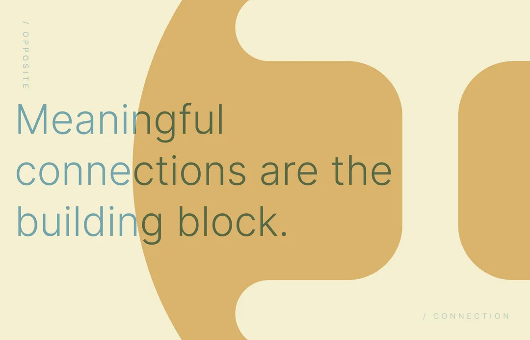
The logo is approachable and structured, blending utility with warmth; It's influenced by the Japanese Kanji for 'construction' both visually and in meaning. Color choices favor calm tones with a modern edge (achieved through diffusion which is conceptually what's happening). Typography is functional but friendly, emphasizing accessibility and clarity without losing personality.


I created a foundational identity system including logo, type, color, and visual examples. Each element was designed to carry the brand’s tone across product, web, and marketing with consistency and ease.


This project reminded me that simple ideas, when distilled just right, can create lasting brands. Reach-a-Human’s visual system proves that being human and being digital aren’t opposites.
Contact Aether Creative Studio to discuss web design, branding, and digital platform development. Use our form, schedule a call, or contact us directly:
We're based in Los Angeles, working with businesses and organizations locally and remotely.