Crafting a Scalable Brand for a Los Angeles Food Icon
Carnitas El Momo is a family-run carnitas operation in Los Angeles with deep roots in street food culture. Known for their rich, fall-apart pork—affectionately dubbed “meat candy”—they gained viral attention through TikTok, YouTube foodies, and a featured spot on Netflix’s Taco Chronicles. As enter a new era, they needed a professional, authentic online presence that could grow.
TeaM: John Hansen
Visual Design / UX/UI Design / Webflow Development
The Green Olive Catering website homepage viewed on a laptop.
Fresh Foundation

Overview

A scalable Webflow CMS build with independent control.

Carnitas El Momo is a family-run food operation that built its cult following one taco at a time. Known across Los Angeles—and the world thanks to Netflix’s Taco Chronicles—for their signature “meat candy,” the family had become a viral phenomenon. As the spotlight grew, they needed a unified brand and digital presence to support marketing efforts, press features, merchandise, and future locations. I worked with the family to refine their visual identity and deliver a lean, high-performing Webflow site that would serve as their digital foundation.
View live website
The structure of the The Green Olive Catering project.The structure of the The Green Olive Catering project.
Split Identity

Challenge

One brand, three kitchens, no structure.

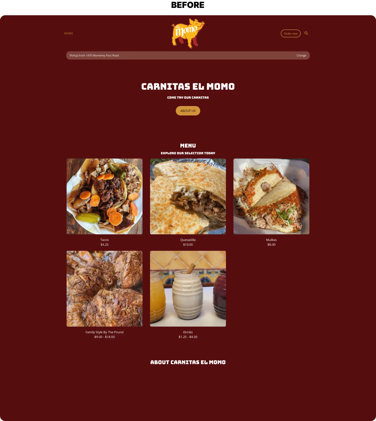
Carnitas El Momo built a cult following from their legendary pork which was originally slung from a backyard kettle in Boyle Heights. But as they expanded to multiple locations, viral TV spots, and upcoming national features, their visual brand and website couldn’t keep up.
The inconsistent websites that the previous locations had.Early wireframes organizing the different location content.
Design with restraint

Approach

Simplicity from the start.

I worked from the ground up to develop a digital experience that didn’t get in the way. I refined their brand expression, clarified the user journey, and built the site to work at the speed of their audience — on the go, in line, or at the curb. The final result was lean and highly functional, mirroring the soul of their operation which was important to capture to me, not only design and technology-wise but for what their story means to Los Angeles.
Split Identity

Solutions

The deliverables created a cohesive, future-ready foundation for Carnitas El Momo:

  • Refined brand identity to unify the visual language
  • Style Guide to with guidance and definitions
  • High-performance Webflow site with room for scalable growth
  • Brand-ready assets prepared for multi-channel use
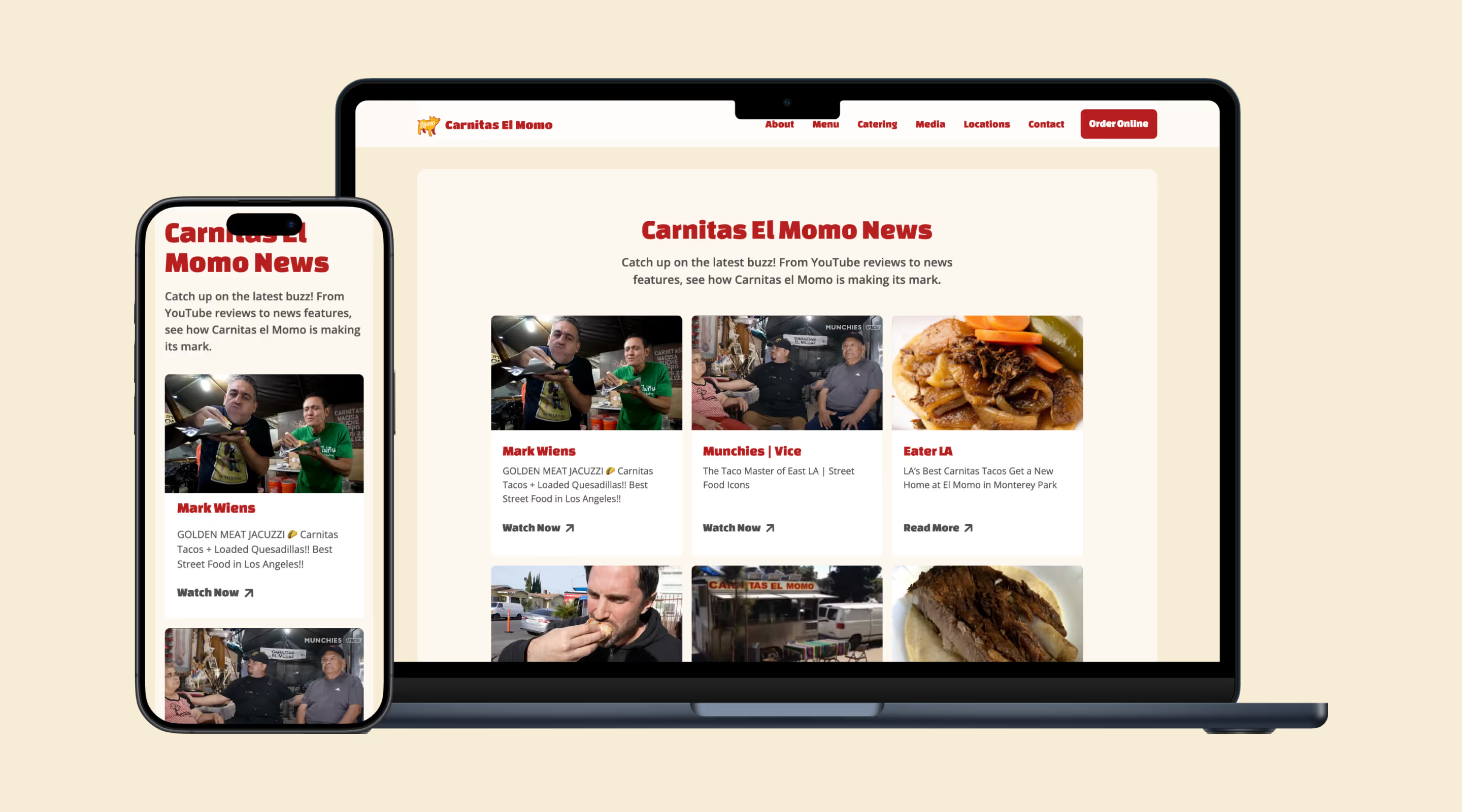
Carnitas El Momo press section displayed on phone and laptop.
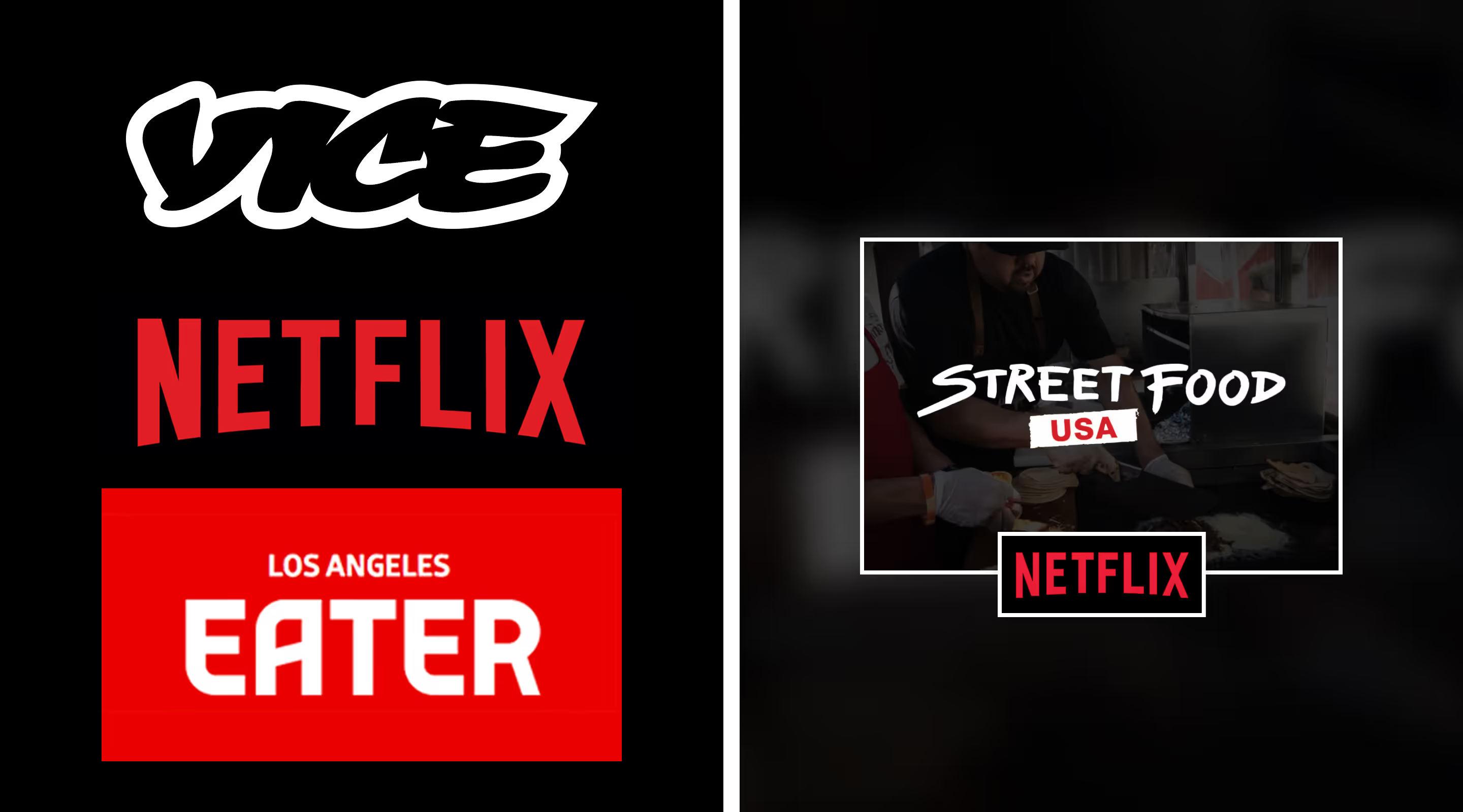
Places where Carnitas El Momo has been featured: Vice, Netflix and Eater (Los Angeles).
Real growth, real recognition

Impact

A brand presence worthy of the legend.

The new design tightened the brand’s visual identity with structured layouts, elevated typography, and a color system rooted in warmth and earth. Though simple, the Webflow build was crafted with scalability in mind using variables, symbols, and clean page architecture to support future modes, new menu and product offerings, or campaign-specific landing pages to support ad and email campaigns. Everything’s in place for the next chapter, and most importantly, the family’s story now has a home that feels like theirs.
Carnitas El Momo catering section displayed on phone and laptop.

Contact Us

Ready to make something?
Book a call or drop us a note—let’s make something.
Your submission has been sent. Thank you.
Something went wrong while submitting the form.