Scalable Webflow Website for a Service-Based Business
Impact
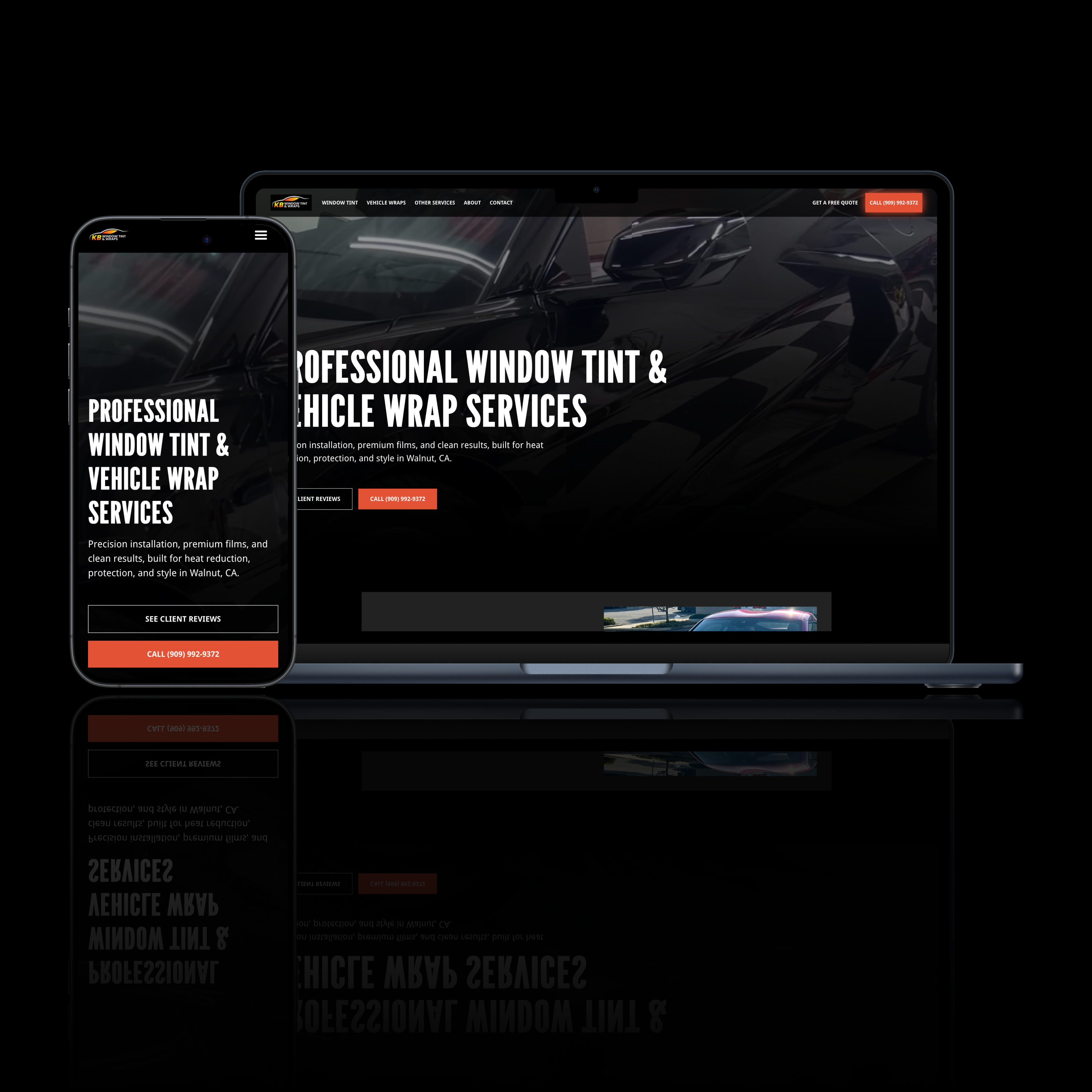
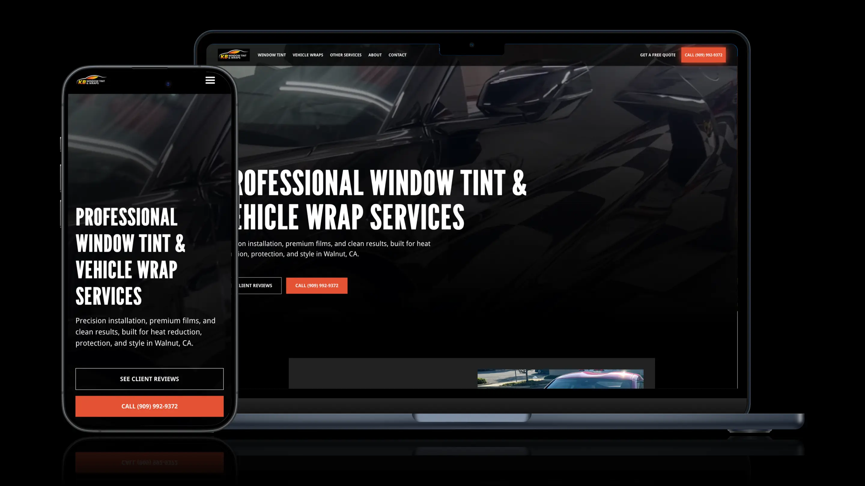
A cohesive, responsive Webflow website built using a Client-First structure to support clarity, scalability, and long-term maintainability.
Context
KB Tint is a service-based business offering professional window tinting solutions. The goal of the project was to move beyond a fragmented or inconsistent web presence and establish a clear, cohesive system that performs reliably across devices while remaining easy to extend over time.
Rather than focusing on visual novelty, the emphasis was on building a responsive foundation that could scale alongside the business without introducing technical debt.
Objective
Design and develop a cohesive, responsive Webflow website using a Client-First structure that supports usability, consistency, and long-term scalability.
Constraints
- Need for consistent behavior across breakpoints
- Requirement for clean, understandable structure for future updates
- Avoidance of over-customization that would reduce maintainability
- Emphasis on system clarity over one-off design solutions
Strategy
The site was approached as a structured system rather than a collection of pages. A Client-First methodology was used to ensure predictable class naming, logical layout patterns, and long-term scalability within Webflow.
Design decisions prioritized responsiveness and cohesion—ensuring the experience feels intentional and consistent regardless of device or screen size.
Design Philosophy
- System-first thinking
- Responsiveness as a baseline, not a feature
- Cohesion across layouts and components
- Simplicity in service of maintainability
System Decisions
- Client-First structure implemented throughout the build
- Responsive layouts designed to adapt cleanly across breakpoints
- Reusable components to reduce redundancy
- Webflow-native solutions prioritized for durability
Deliverables
- Website design
- Webflow development
- Client-First class architecture
- Responsive layout system
- Scalable page structure
Key Features
- Cohesive visual and structural system
- Predictable responsive behavior across devices
- Clean, maintainable class structure
- Flexible layout components designed for reuse
Technology Stack
Design: Figma
Platform: Webflow
CMS: Webflow CMS
Structure: Client-First methodology
Performance: Optimized assets and clean layout logic
Results & Impact
The finished website provides KB Tint with a cohesive, responsive digital presence that is easy to maintain and scale. The Client-First structure ensures future updates can be made efficiently without compromising consistency or performance.
What Made This Successful
Applying a disciplined structural system resulted in a site that feels cohesive, performs reliably across devices, and avoids the fragility common in over-customized builds.
What We’d Carry Forward
- Client-First as a foundation for scalable Webflow projects
- System-driven responsiveness over breakpoint-specific fixes
- Reusable components as a default strategy
Expert Insight
For service-based businesses, long-term success in Webflow often comes down to structure. A cohesive, responsive system built with Client-First principles reduces maintenance friction and supports sustainable growth over time.