Onino Pizza
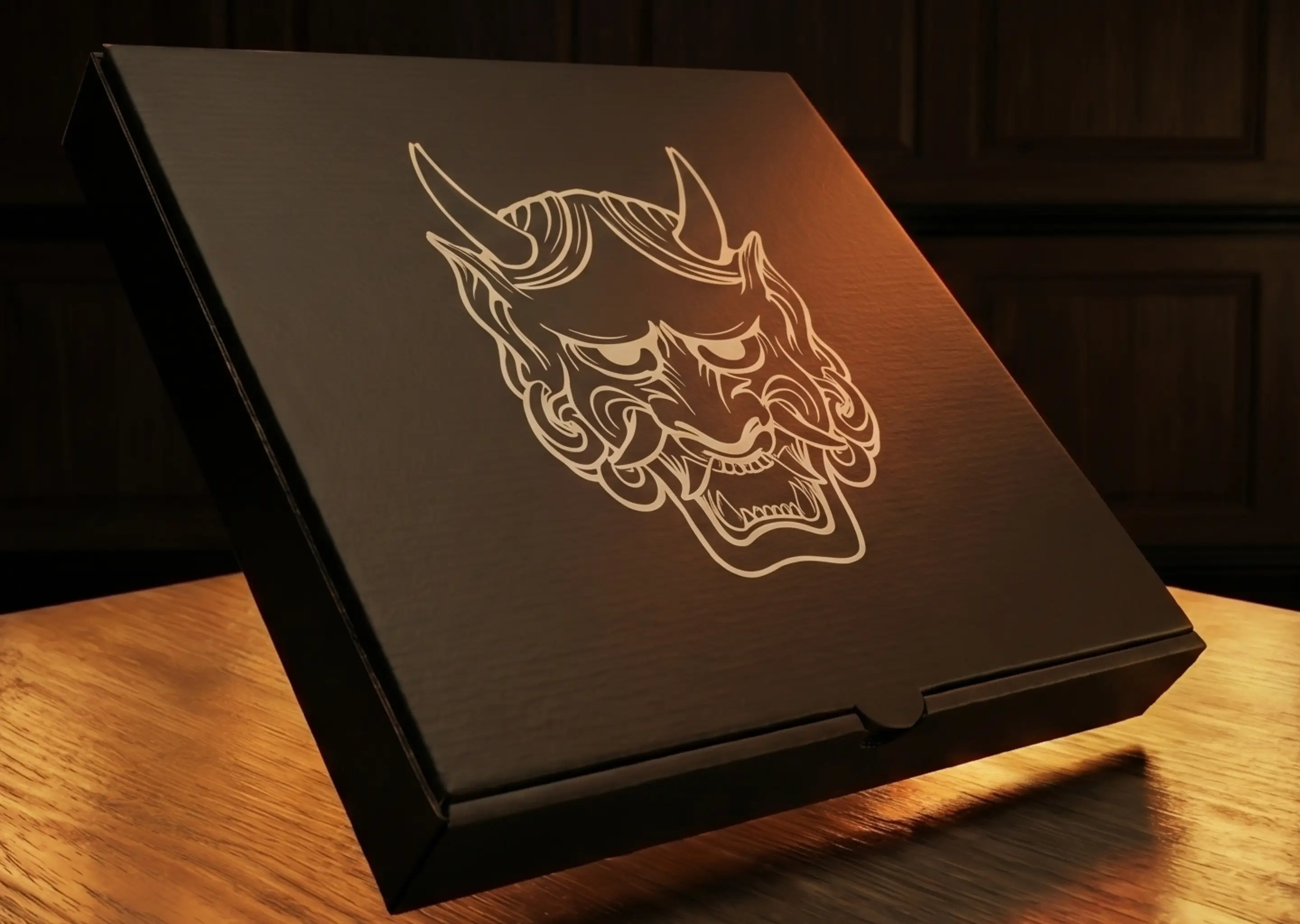
Custom logo illustration designed to capture the brand’s artisanal spirit — balancing friendliness and intensity through a mark that reflects craftsmanship and creates a memorable foundation for the handcrafted pizzeria’s identity.
Overview
Onino Pizza is a California-based pizza restaurant built around craft pizza. From the outset, the goal was to create a visual identity that felt as considered and crafted as the food itself, from recognition to understanding of most clients— something that could carry the restaurant's personality consistently across every customer touchpoint, from the first impression on signage to the final interaction.
Aether Creative Studio was engaged to develop a complete brand identity system for Onino Pizza, establishing the visual foundation the restaurant would need to launch with confidence and grow with consistency.
Challenge
Onino Pizza needed a visual identity that could do more than identify the restaurant, it needed to establish a serious yet friendly personality. As a new entrant in a competitive hospitality market and catering to a unique combination of family and pizza enthusiast. the brand required something distinct and memorable enough to stand apart while still capturing the warmth and familiarity that defines a neighborhood pizza experience.
The identity also needed to work at scale. From the moment of launch, the brand would need to function consistently across a wide range of applications: storefront signage, menus, packaging, apparel, social media, and future digital platforms. A logo that worked in one context but broke down in another was not an option.
The challenge was finding the right balance — modern enough to feel current, simple enough to be timeless, and warm enough to feel welcoming. The mark had to be built to last, with enough flexibility to grow alongside the brand without requiring a redesign every time Onino Pizza expanded into a new format or channel.
Solution
Aether Creative Studio designed a custom brand identity system centered around a bold, approachable logo mark built on three principles: simplicity, flexibility, and strong visual recognition.
The logo was designed to perform consistently across both physical and digital applications — legible at the scale of a storefront sign, effective at the scale of a social media profile image, and distinctive enough to anchor packaging, menus, and branded apparel. Every design decision was pressure-tested across multiple contexts before the system was finalized.
Results
The completed brand identity gave Onino Pizza a more cohesive and professional presence across every customer-facing touchpoint. Marketing materials, signage, packaging, and digital assets now operate from a single, consistent visual system — improving brand recognition and reducing the inconsistency that often emerges when a growing hospitality brand lacks a defined design foundation.
The system established a scalable visual platform capable of supporting Onino Pizza's next phase of growth — whether that means expanded locations, new product lines, or deeper investment in digital and social marketing.
Services Provided
- Logo Design
- Visual Direction
Frequently Asked Questions
A custom illustrative logomark gives a restaurant a visual identity that no competitor can replicate. For a handcrafted pizza brand, illustration communicates craft, personality, and care in a way that typographic or geometric marks often cannot. The Onino Pizza mark was designed to be instantly recognizable across signage, packaging, and digital — balancing a fierce, bold character with approachable warmth that invites rather than intimidates.
The balance between friendly and fierce comes down to three things: form, weight, and expression. Rounded forms and open shapes read as approachable; sharper angles and heavier linework read as bold and confident. The key is finding a proportion where both qualities coexist without either canceling the other out. For the Onino Pizza mark, that meant an extensive exploration of character and linework — testing how much intensity the illustration could carry before it stopped feeling welcoming, and how much warmth it could hold before it lost its edge. The final mark sits at a precise point between the two: bold enough to command attention on a storefront sign, approachable enough to belong on a family pizza box.
The tension between friendly and fierce is a design problem solved through form, weight, and expression. For Onino Pizza, the illustrative mark was developed through an extensive exploration of character, linework, and proportion — finding the precise point where boldness and approachability coexist. The result is a mark that commands attention on a storefront while remaining welcoming enough to anchor a family dining experience.
Handcrafted food brands benefit from visual identities that communicate the same intentionality as the product itself. An illustrative logomark signals that the brand was built with care — that someone drew it, refined it, and made deliberate choices about every line. For a pizza restaurant competing in a market full of generic typography and stock iconography, a custom illustration is a meaningful differentiator that customers remember.
The mark was pressure-tested across every format it would need to inhabit — from large-scale storefront signage to small-format packaging labels, social media profile images, and apparel. Illustrative logos introduce complexity that must be managed carefully at small sizes, so the linework and proportions were refined to maintain clarity and character whether the mark appears at two inches or two feet.
Contact Us
Contact Aether Creative Studio to discuss web design, branding, and digital platform development. Use our form, schedule a call, or contact us directly:
- Email: info@aethercreative.studio
- Phone: (424) 248-8319
We're based in Los Angeles, working with businesses and organizations locally and remotely.